
How to Find Your Undertone and Color Season (and Finally Wear Your Best Colors)
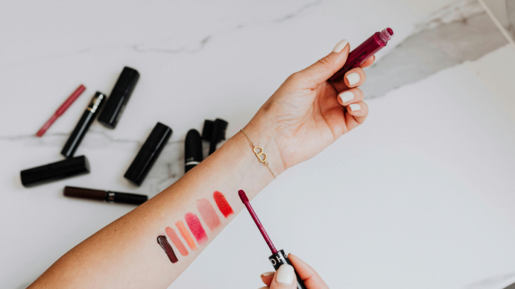
There’s a shirt in your closet that when you wear it makes everyone say “Wow!! You look AMAZING!” Then there’s the one where people ask if you’re feeling okay. Well, that might be a little dramatic, but there’s truth in the idea that certain colors just look better on your than others. It’s called your color season, and it’s based on a few different factors, from your hair and eye color to one of the biggest ones: your undertone.
If you buy through our links, we may earn a small commission at no cost to you. As an Amazon Associate, we earn from qualifying purchases. Our policy
Finding out which undertone you have and what your color season is has become a full-fledged internet phenomenon. Videos showing color analysis have been viewed over a hundred million times, and there are now even some people flying to South Korea to have it done in-person (we’ll talk about that, too). On the bright side, you can get this done online using several free tools which we’ll link to. Or you can hire an online company to do it for you. I did this a few years back and I’ll show the results below.
What an Undertone Actually Is
Your skin is two colors. The one on top is the one that changes based on the time of year and your sun exposure among other factors. This one tans during July, becomes somewhat pale by February, gets flushed when someone surprises you unexpectedly. Below it lies your undertone. This one never changes, no matter the weather or your age. This is why fair skin can have a warm undertone and deep skin can have a cool undertone, and why two women wearing the same foundation shade can look like two entirely different people in the same sweater.
There are three skin undertones: Warm, Cool, and Neutral. Warm skin leans toward golden, peach, yellow. Cool skin leans toward pink, red, blue. Neutral skin is a mixture of both that doesn’t lean too heavily into either. Many makeup artists recognize a fourth category called “olive,” which is characterized by a faint green or gray tint, and this is often labeled separately.
The Four At-Home Tests (and How Much to Trust Each One)
Each of these is subjective, so consider each one a guide rather than the definitive word on your undertone. Complete each test at a window using a clean, bare face. A yellow bathroom light or too much makeup will skew your results.
The vein check
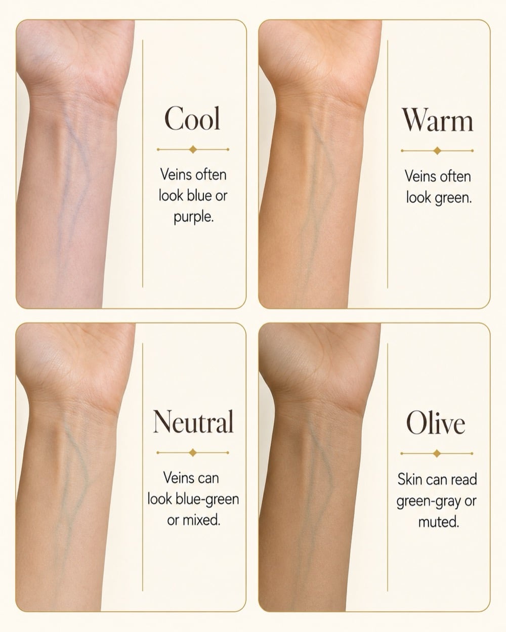
Turn your wrist over toward the light. Green-looking veins point warm, blue or purple point cool, and a blue-green you can’t quite call points neutral. It’s the test everyone reaches for first, and the one that holds up the worst. Your veins aren’t actually blue, by the way, the color is a trick of how light bounces around under your skin, which physicists wrote about in a cleverly titled 1996 paper called, no joke, “Why do veins appear blue?”
However, not all experts believe the vein check is the end-all-be-all. Terri Tomlinson, the makeup educator behind the Flesh Tone Color Wheel that a ton of artists train on, puts it less politely: “if you look at the physiology of skin, the vein test doesn’t fly.” It’s also harder to read on deeper-color skin. So with that in mind, use the vein check as a first guess, not the final answer.
The jewelry check
Test gold and silver against opposite sides of your face. Does one make your features pop, or clash? Generally, gold tends to complement warm skin, while silver or platinum tends to complement cool skin. If neither gives you a clear winner, congratulations, you’re neutral. One major issue here is loyalty. Most people have spent thirty years committed to a particular metal, and our loyalty often wins over anything else. So if you can’t trust your own judgement, ask that one friend who has no problem telling you she doesn’t like that outfit you’re wearing!
The sun check
The conventional wisdom says people who tan quickly are warm and people who burn are cool. Don’t believe it. Melanin levels (your dermatologist refers to it as phototype) determine how you react to sunlight, not your undertone. Plenty of warm-toned women can develop severe burns within ten minutes. Similarly, deep-skinned people who rarely burn may still be cool-toned. I’d rate this method half believable at best.
The white tee check
I like this method because it sidesteps all guesswork and asks one simple question: do I look good in this color? Put on a white t-shirt or put a piece of white fabric directly under your chin near the window, then substitute it with cream or ivory and monitor the difference. If white brings out the best in your features, you’re probably cool. But if white drains you while cream looks amazing, then you’re probably warm. If you look good in both white and cream (lucky you!), you’re most likely neutral, making your shopping trip just a bit simpler.
If every test tells you something different
If all four tests give you four different answers, well, you’re in good company. The color analysis forums (especially this one on Reddit) are full of women who ran every test and came out more confused than they went in, and they’ll be the first to say so. “More often than not, the comments are inconclusive and contradictory,” one commenter wrote under the thousandth what’s-my-undertone post, before landing somewhere helpful: “if you can’t determine warm or cool easily for your coloring, it may not be that important to your palette.” And she’s right. An undertone that won’t cooperate with any test is usually just neutral, and neutral means more colors work on you, not fewer. That’s good news!
What the Pros Do Instead

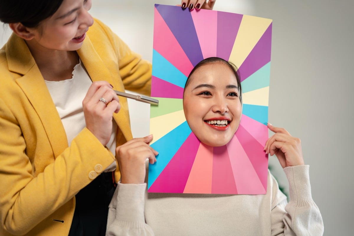
The pros skip all the guesswork and go straight to the source. It’s called draping: you sit in front of a mirror in plain, neutral light while an analyst holds up cloth after cloth under your chin, watching what each color does to your face. The right ones work with your coloring and make your features pop. The wrong ones just seem to work against you. It’s weirdly mesmerizing to sit through. The before-and-afters people post from these sessions get comments like “that purple makes you absolutely glow!”, and you can see it too, even looking at the pictures your phone.
And none of this is new, by the way. It’s about a hundred years older than TikTok, and it started in art school.
Johannes Itten, who taught color at the Bauhaus, noticed his painting students kept reaching for the same palettes that matched their own coloring, and he laid out four seasonal types in his 1961 book The Art of Color. Carole Jackson turned it into a full-on craze with Color Me Beautiful in 1980, the kind of book that had women all over America asking each other if they’d “had their colors done” (it hit its 31st printing by 1983). If you sat through a department store makeover in 1984 with swatches held up to your chin, congratulations, you were doing this way before TikTok.
The modern version of that department store chair is in Seoul now. Korean studios have turned color analysis into this precise, fully photographed experience, and it’s become a reason to book a flight (along with cosmetic procedures, but that’s a different story). Time wrote a whole story on it and reported sessions running about $80 to $160, with the Korea Tourism Organization practically pointing tourists straight to them. One BEE described her appointment like a pilgrimage: “I went to a studio with my friend to get our personal color analysis done! I got a Summer Pale for my main daily color, and a Summer or Autumn Soft for makeup.”
From the Hive
The buzz from our Beauty Empties Experts. Sign up to join!
Something a lot of BEEs notice about a professional draping session: the analyst spends significantly more time on the contrast levels (the hair, eye, and skin differences) than on pinning down the exact undertone, and you sit through twenty failed colors before finding three that work. Virtually all BEEs report landing in the same general area: it’s a fun indulgence but not really a necessity. Do the free tests first.
So How Is a Color Season Actually Decided?
If you’ve ever wondered how an analyst lands on a specific label like mine, it comes down to three things color scientists have been measuring for more than a century. They come straight from the Munsell color system, and analysts just translate them into plainer words. Hue is the warm-versus-cool question you already know. Value is how light or deep your coloring is (picture yourself on an old black-and-white TV). And chroma is whether your coloring is soft and muted or bright and clear. Everyone, and every color, is some mix of those three.
Itten’s original four seasons each lean a certain way on those dials: Spring is warm, light, and bright, Summer is cool, light, and soft, Autumn is warm, deep, and soft, and Winter is cool, deep, and bright. The modern version splits each of those four into three, twelve in total, based on whichever dial is loudest. That’s how you land on a label like mine. I’m apparently a Light Summer. Do you agree?
For reference, here are all twelve, grouped by their parent season. You can see them laid out next to my makeup-free face I used for the analysis.
- Spring: Light Spring · True (Warm) Spring · Bright Spring
- Summer: Light Summer · True (Cool) Summer · Soft Summer
- Autumn: Soft Autumn · True (Warm) Autumn · Deep Autumn
- Winter: Bright Winter · True (Cool) Winter · Deep Winter
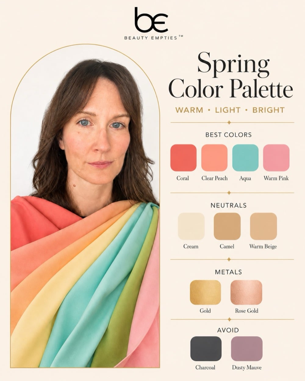
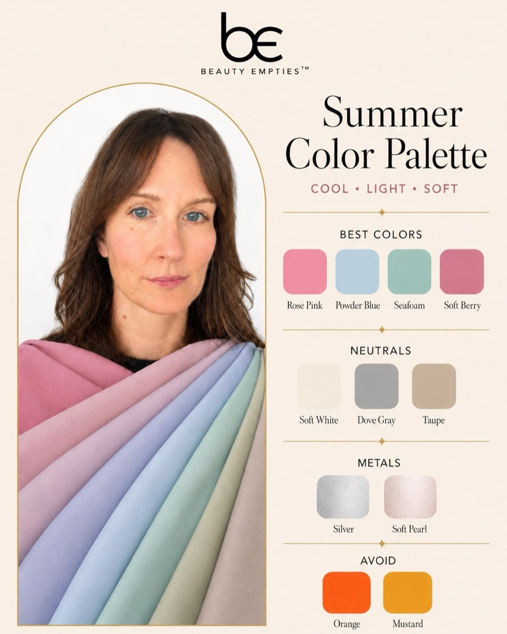
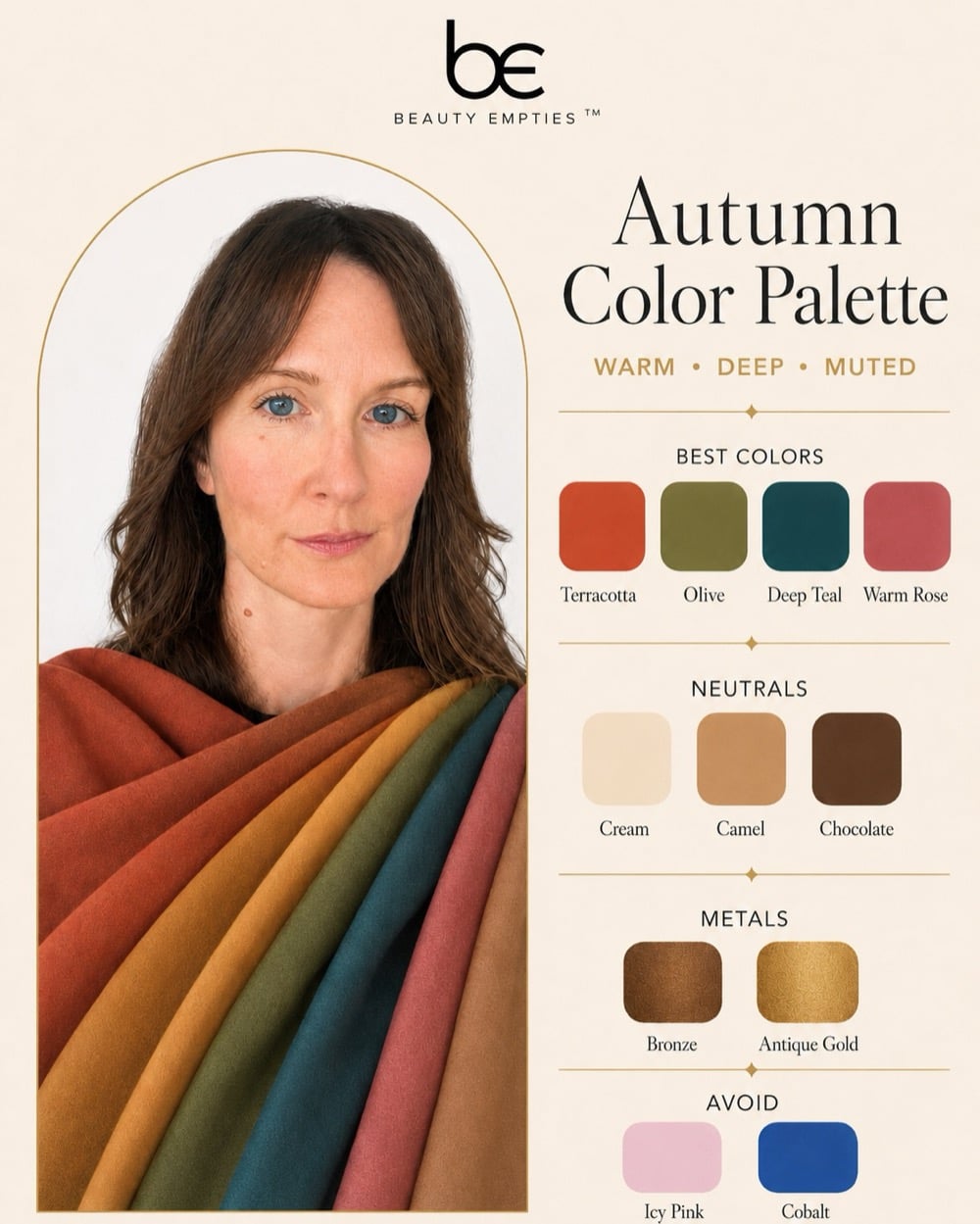
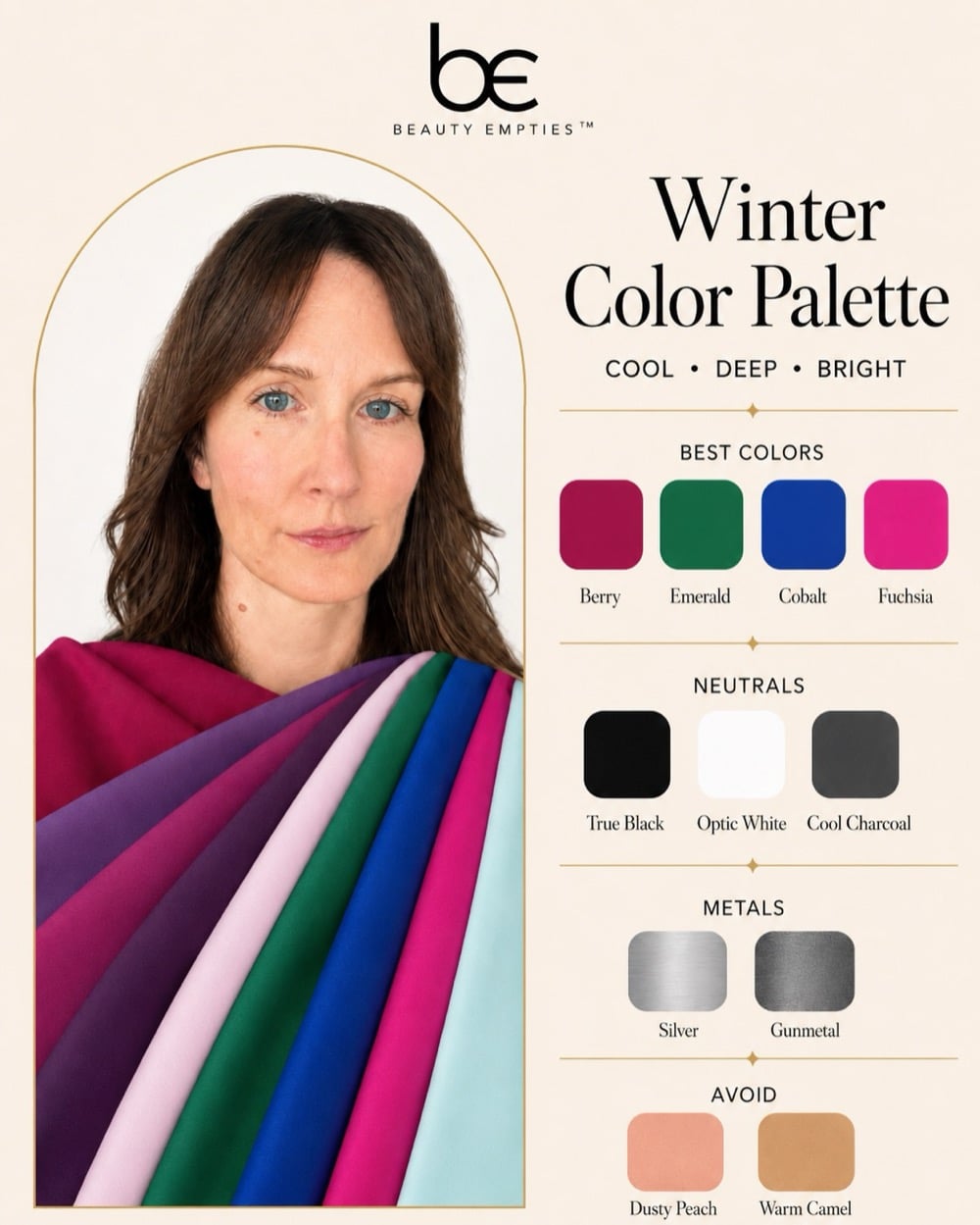
One thing worth knowing before you scroll on: your undertone and your color season work together. Undertone is the hue piece (warm, cool, or neutral). Your season takes that and layers on how light or deep and how soft or bright you are. That’s why Spring and Autumn are the warm seasons, and Summer and Winter are the cool ones. It’s also why the color guides further down are sorted by undertone: find your season, note whether it runs warm or cool, and the right shades fall into place.
You Don’t Have to Fly to Seoul
If a plane ticket feels like a lot to figure out which pink to buy, the internet has you covered. A handful of apps now do a version of the same thing from your couch. Colorwise (it’s called My Best Colors in the App Store) has been at this since 2017, and it projects color swatches onto your face through your phone camera, which is about as close to real draping as an app gets, for a one-time $14.99. ColorMine AI is free and says it trained on tens of thousands of professional draping sessions. There are a dozen others, most of them landing somewhere between a fun quiz and some actually good results.
Personally, I would not fly anywhere to get my colors done when you can get a pretty good option online. It likely won’t be as good, but good enough to get an accurate answer. There are also entire Reddit threads dedicated to the subject!
And if you want the full human treatment without the airfare, plenty of consultants do it remotely now. That’s the route I took. I sent my photos off to Curate Your Style in London and got back a full palette plus a makeup guide broken down by exactly which foundations, blushes, and lip shades to look for.
My Color Analysis
I’ve never really felt like I knew what my best colors were. I know the colors I like (white, black, yellow, copper, emerald green) but I don’t always think they’re my best ones. I’ve got fairly “ruddy” skin that can be fair or tan, and my eyes are blue. My hair used to be pretty light as a kid, but now it’s pretty naturally dark (minus the grey hairs I get covered up).
So, as I said I got mine done a few years ago with Curate Your Style. This had absolutely nothing to do with their service, but I just hated my results. I then went on to try a few other online tools with the same outcome. It turns out I’m in the summer family (I’ve gotten everything from True to Light), and every color in the wheel is one I try to avoid. Cool pinks, blues, blugh. I feel like my closet would look like a nursery! In my heart I really want to be an Autumn, but apparently it’s not in my cards!
My makeup suggestions I understand more. The makeup guide told me to keep my foundation cool with a rosy tint instead of gold, swap black mascara for a muted brown (they said black is a little heavy on my complexion), and lean into rose, silver, and soft pink colors.
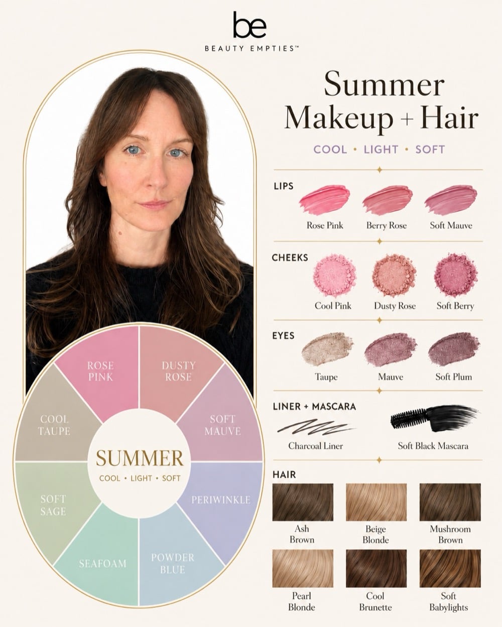
I’ve been wearing brown mascara lately, and I have to say, I’ve gotten more compliments with it than I ever did with black. (I’m still not sold on the ash brown they picked for my hair, though.) This is really where you have to decide how much weight you’ll put behind your analysis.
So, that’s where I’ve landed. My results say summer, my heart says autumn, and I’m going to keep wearing my rust and my terracotta anyway. Take your own results the same way: as really good information, not a court order.
Your Best Colors If You’re Warm
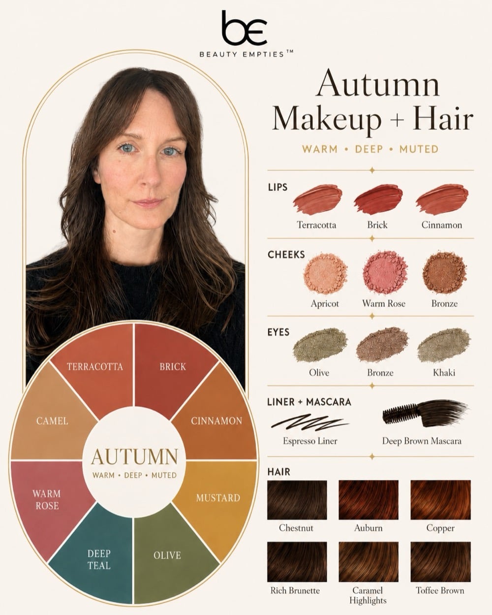
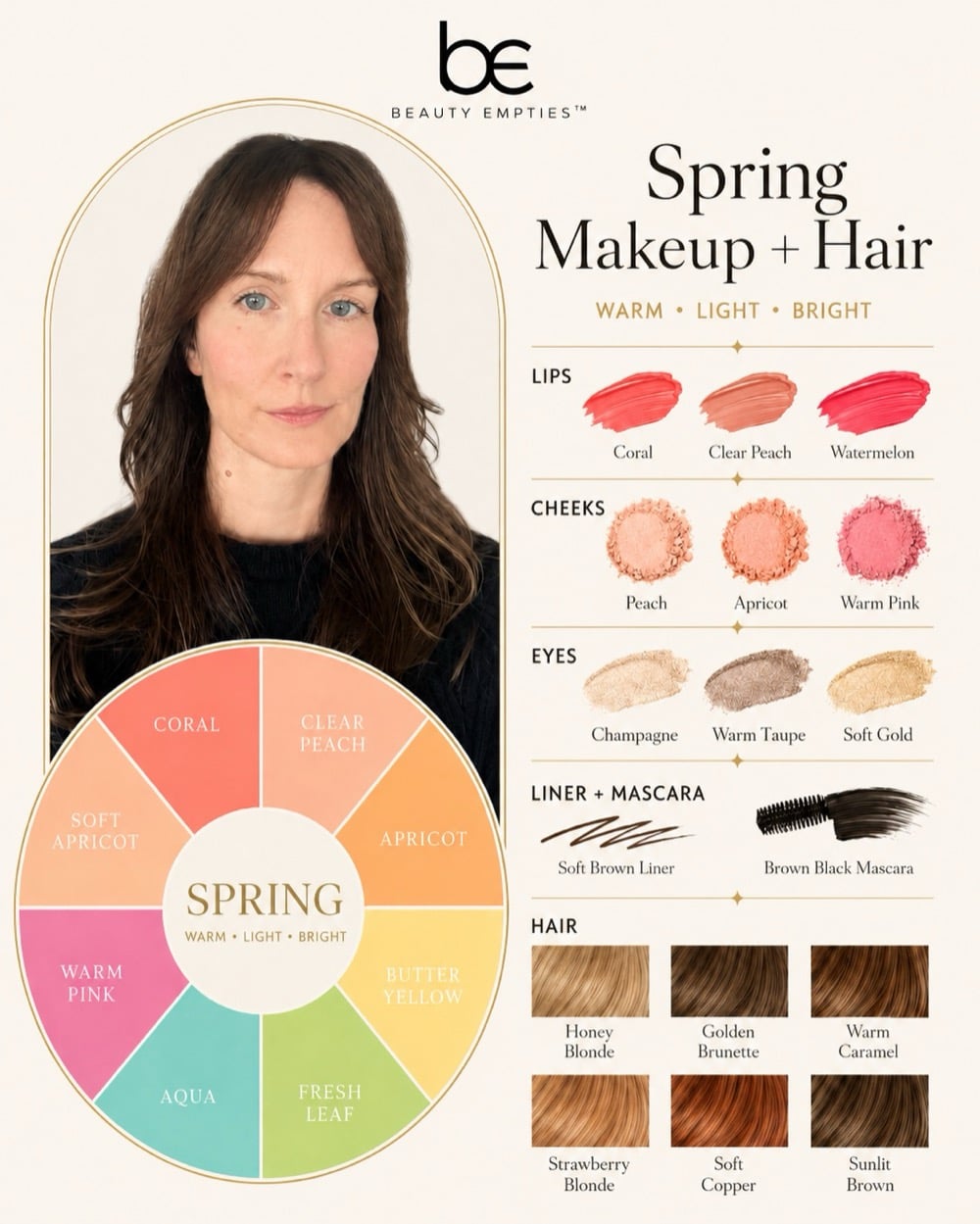
Warm skin looks best in golden light, so lean into it. Your colors are the ones you’d find in a spice cabinet or on an October hike: camel, cream, chocolate brown, olive, rust, terracotta, tomato red, coral, marigold, all the warm greens. For neutrals, go with ivory and tan instead of stark white and black, which can look a little costume-y on golden skin. The ones most likely to fight you are icy pastels, cold fuchsia, and blue-based gray.
In makeup, warm means a golden-based foundation, peachy or apricot blush, and lipstick in orange-red, brick, or a warm nude. The foundation label does the work for you: anything marked W or G is made for you. The part that trips everybody up, though, is worth memorizing: in MAC’s system it’s the NC shades (golden beige) that are right for warm skin, not the ones that sound warmer, because those letters describe the shade’s cast, not yours. Gold jewelry, a warm brown liner, and a bronzy shadow round it out.
Your Best Colors If You’re Cool
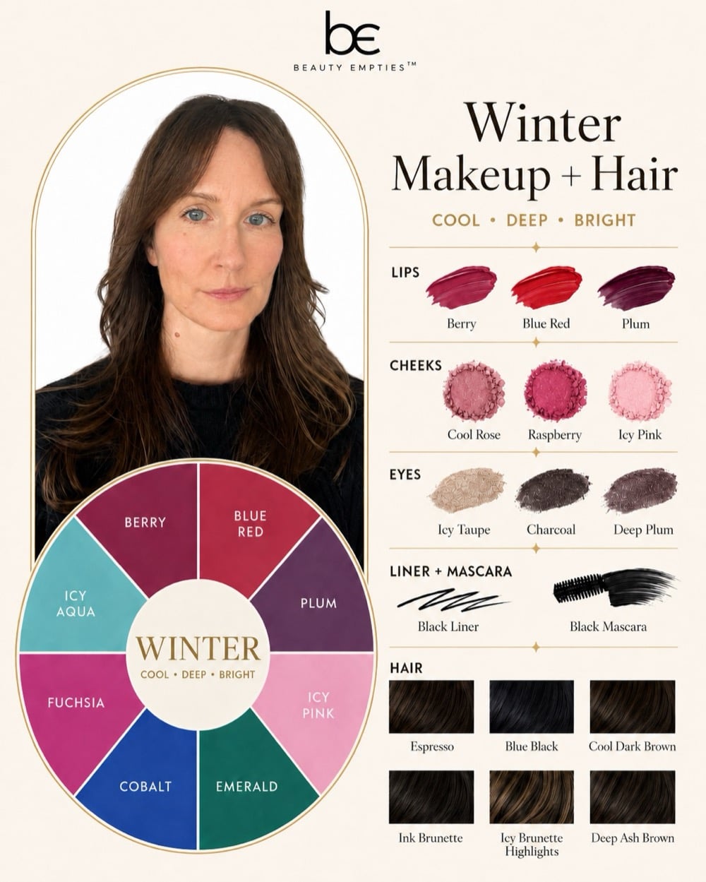
Jewel-toned colors are your friends if you have cool skin. These include sapphire, emerald, amethyst, and a truly blue-based red. So do raspberry, lavender, icy pink, and every blue color on the rack. You also have more luck pulling off stark white, charcoal, and true black than your warm counterparts, so these are some of your neutral colors, including cool grays and navy. Colors such as orange, rust, marigold, and yellowish-brown can create an unpleasant sallow effect against pink-toned skin.
For makeup, look for foundations marked C (cool) or R (rose), pink or berry blush, and a blue-based lipstick: cherry red, plum, mauve, cool pink. At MAC, you’re on the NW side of the wall. Silver jewelry, a black or gray liner, and taupe shadow will always look more natural on you than bronze. And if you’ve been reaching for a golden foundation because it felt like the safe bet, then wondering why you look a little tired in every photo, this is your sign to switch.
Your Best Colors If You’re Neutral
If you’re neutral-skin toned, you have access to just about everything. You can wear almost anything provided you steer clear of the extreme versions. Colors such as soft white, taupe, gray-green, muted pink, teal, and muted navy will all suit you beautifully. Your greatest adversaries will be the brightest colors on the racks (electric fuchsia, neon orange, highlighter-neon) since any color that bright will consume your relatively balanced skin tone. Warm- and cool-toned women each lose about half the store, but neutral-toned women are limited only by their willingness to avoid the extremely bright hues.
You’ll find that foundation marked N is yours as well, and you’ll find matching shades more frequently than either of your warm and cool peers will, which is either a blessing or a curse depending on the day. Rose-beige blush, mauve or soft berry lipstick, both metals in the dish, all will work. To cut down on the overwhelming number of options, adopt the technique used by stylists everywhere: choose whichever color appeals to you and select the milder, more muted version of that color. More often than not, it will behave correctly.
From the Hive
When BEEs talk about the undertone payoff, they almost always mean foundation, not clothes. Getting the correct depth but misjudging the undertone is precisely why a certain shade appears wonderful in the bottle yet looks dreadful on your jawline, and why more than a few BEEs attest that changing merely one letter in their foundation number (W to N or N to C) corrected their perpetual “mystery orange” or “mystery gray” that had never successfully blended despite countless attempts.
After looking at these cards I put together for the article, I can kind of see that Summer tones are better on me. Sigh. But that doesn’t mean I have to always wear them. The heart wants what the heart wants, so keep that in mind even after you get your results.
So, what color season do you think you are? And which one do you wish you were?
A cruelty-free mark means the brand is certified by PETA, Leaping Bunny, or both at the time of writing. A missing mark doesn’t mean a brand tests on animals; it just means the brand isn’t certified by these programs.
What Our BEEs Are Buzzing About
Here’s what the beauty community is saying about finding your undertone and your colors:
Want to become a Beauty Empties Expert?
BEEs get free products to test, exclusive discount codes from our brand partners, and live access to The Hive sessions with dermatologists and beauty editors. Spots are limited and hand-picked.
Related Articles
- The Best Foundations for Women Over 50, From a $16 Drugstore Serum to a $69 Splurge
- Eyeliner Over 50? Here Are 7 Habits Worth Updating, According to Makeup Artists
- Makeup Mistakes to Avoid After 60 (and What to Do Instead)
- The Right Makeup Application Order (and Why Your Blush Keeps Disappearing by Lunch)
- These Are the 1970s Beauty Trends Women Over 60 Voted to Bring Back




I think you are a bright/clear who can wear both warm & cool colors, but not so many deep/pale/muted shades. Like Courtney Cox and Katy Perry, the characteristics are a high contrast between skin and hair and bright jewel-like eyes. Warm and cool are less important than the clarity. You can wear that emerald of Bright/Clear winter but also I bet you look great in spring’s Bright/Clear hot pink. Something to think about.